In this article, I will explain you how to plot marginal density plot and different examples to customize marginal plot like custom color for plot, no space for marginal plot, huge space for marginal plot and control ratio for marginal density plot in python. Density plot require numeric values dataset to display chart.
To customize marginal density plot in python use jointplot() function of seaborn library.
Installation of Packages
We will need seaborn package to load dataset and plot marginal density graph in python program. If you don’t have these packages installed on your system, install it using below commands.
pip install seaborn
Cool Tip: Know more about how to plot basic area plot in python!
Marginal Density Plot in Python
Let’s see an example to create marginal density plot in python using seaborn library.
Installation of Packages
We will need seaborn package to show marginal density plot. Install package using below command.
pip install seaborn
Import libraries
Import seaborn library in our python density plot code.
# Import library

import seaborn as sns
Prepare dataset
Seaborn library has inbuilt datasets. We will use tips dataset to visualize density plot
- Load tips dataset using load_dataset() function of seaborn library in df variable
# Load the tips dataset
df = sns.load_dataset('tips')
Plot Marginal Density Graph using jointplot()
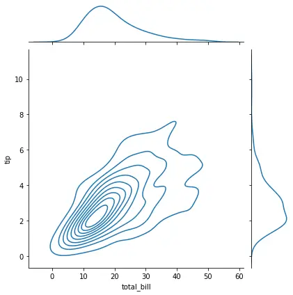
Use sns.jointplot()function of seaborn module to draw marginal density graph.
- The first argument defines x axis dataset use for plot
- The second argument defines y axis dataset
- The third argument in defines kind with option as kde
# Custom the inside plot: options are: “scatter” | “reg” | “resid” | “kde” | “hex”
sns.jointplot(x=df["total_bill"], y=df["tip"], kind='kde')
Marginal Density Plot Python Code
Use below entire density graph python code using seaborn library
# library & dataset
import seaborn as sns
df = sns.load_dataset('tips')

# Custom the inside plot: options are: “scatter” | “reg” | “resid” | “kde” | “hex”
sns.jointplot(x=df["total_bill"], y=df["tip"], kind='kde')
Marginal Density Plot Python Visualization Output
Cool Tip: Know more about how to plot horizontal line graph in python!
Marginal Density Plot with color in Python
Let’s see an example to customize color for marginal density plot in python using seaborn library.
Installation of Packages
We will need seaborn package to show marginal density plot. Install package using below command.
pip install seaborn
Import libraries
Import seaborn library in our python density plot code.
# Import library

import seaborn as sns
Prepare dataset
Seaborn library has inbuilt datasets. We will use tips dataset to visualize density plot
- Load tips dataset using load_dataset() function of seaborn library in df variable
# Load the tips dataset
df = sns.load_dataset('tips')
Plot Customize Color Marginal Density Graph using jointplot()
Use sns.jointplot()function of seaborn module to draw marginal density graph.
- The first argument defines x axis dataset use for plot
- The second argument defines y axis dataset
- The third argument defines kind with option as kde
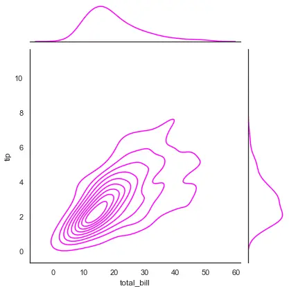
- The fourth argument defines color as magenta
# Custom the color for marginal density plot
sns.set(style="white", color_codes=True)
sns.jointplot(x=df["total_bill"], y=df["tip"], kind='kde', color="magenta")
Customize Color for Marginal Density Plot Python Code
Use below entire density graph python code using seaborn library
# library & dataset
import seaborn as sns
df = sns.load_dataset('tips')

# Custom the color for marginal density plot
sns.set(style="white", color_codes=True)
sns.jointplot(x=df["total_bill"], y=df["tip"], kind='kde', color="magenta")
Marginal Density Plot Python Visualization Output
Cool Tip: Know more about how to plot customized area graph in python!
Customized space Marginal Density Plot in Python
Let’s see an example to plot no space marginal density plot in python using seaborn library.
Installation of Packages
We will need seaborn package to show marginal density plot. Install package using below command.
pip install seaborn
Import libraries
Import seaborn library in our python density plot code.
# Import library

import seaborn as sns
Prepare dataset
Seaborn library has inbuilt datasets. We will use tips dataset to visualize density plot
- Load tips dataset using load_dataset() function of seaborn library in df variable
# Load the tips dataset
df = sns.load_dataset('tips')
Plot No space Marginal Density Graph using jointplot()
Use sns.jointplot()function of seaborn module to draw marginal density graph.
- The first argument defines x axis dataset use for plot
- The second argument defines y axis dataset
- The third argument defines kind with option as kde
- The fourth argument defines color as grey
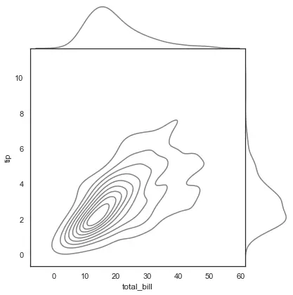
- The fifth argument defines space as 0 , it means no space
# No Space marginal density plot
sns.jointplot(x=df["total_bill"], y=df["tip"], kind='kde', color="grey", space=0)
No Space Marginal Density Plot Python Code
Use below entire density graph python code using seaborn library
# library & dataset
import seaborn as sns
df = sns.load_dataset('tips')

# No Space marginal density plot
sns.jointplot(x=df["total_bill"], y=df["tip"], kind='kde', color="grey", space=0)
No Space Marginal Density Plot Python Visualization Output
Plot Huge Space Marginal Density Plot
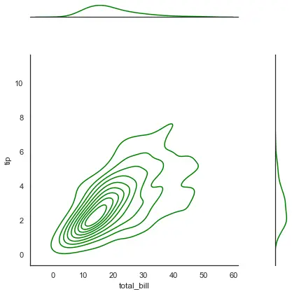
Use jointplot() function to plot marginal density plot in python. Use space =3 to customize huge space for marginal density plot.
# Huge Space marginal density plot
sns.jointplot(x=df["total_bill"], y=df["tip"], kind='kde', color="grey", space=3)
Huge Space Marginal Density Plot Python Code
# library & dataset
import seaborn as sns
df = sns.load_dataset('tips')

# Huge Space marginal density plot
sns.jointplot(x=df["total_bill"], y=df["tip"], kind='kde', color="green", space=3)
Huge Space Marginal Density Plot Visualization Output
Cool Tip: Know more about how to control rug and density of histogram plot in python!
Control Ratio Marginal Density Plot in Python
Let’s see an example to control ratio for marginal density plot in python using seaborn library.
Installation of Packages
We will need seaborn package to show marginal density plot. Install package using below command.
pip install seaborn
Import libraries
Import seaborn library in our python density plot code.
# Import library

import seaborn as sns
Prepare dataset
Seaborn library has inbuilt datasets. We will use tips dataset to visualize density plot
- Load tips dataset using load_dataset() function of seaborn library in df variable
# Load the tips dataset
df = sns.load_dataset('tips')
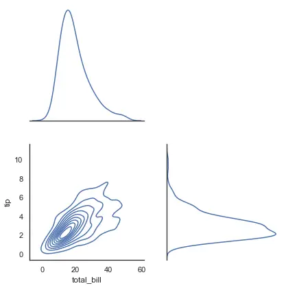
Plot Customize Ratio Marginal Density Graph using jointplot()
Use sns.jointplot()function of seaborn module to draw marginal density graph.
- The first argument defines x axis dataset use for plot
- The second argument defines y axis dataset
- The third argument defines kind with option as kde
- The fourth argument defines ratio as 1
# customize ratio and plot density plot
sns.jointplot(x=df["total_bill"], y=df["tip"], kind='kde',ratio=1)
Customize Ratio for Marginal Density Plot Python Code
Use below entire density graph python code using seaborn library
# library & dataset
import seaborn as sns
df = sns.load_dataset('tips')

# customize ratio and plot density plot
sns.jointplot(x=df["total_bill"], y=df["tip"], kind='kde',ratio=1)
Control Ratio Marginal Density Plot Python Visualization Output
Cool Tip: Know more about how to plot multiple subplot line chart in python!
Conclusion
I hope you found above article on marginal density plot in python program using seaborn package informative and educational.
Use sns.jointplot() function of seaborn module to create marginal density plot in python program. color, ratio, space to customize color, ratio and no space or huge space in marginal density plot.