Whenever you are working with statistical tools that require data to be normally distributed, then probably we quickly want to check first that our data is normally distributed or not.
The quantile plot (Q-Q plot) is the easiest way to visually check whether the given data is normally distributed or not.
In this tutorial, we will discuss how to create a QQ plot for a set of data in python with step by step examples.
Check Samples Distribution in Q-Q plot
In the Q-Q plot, we fixed the one sample of known distribution usually that is a normal distribution( but not in every case) and we compare the second unknown sample with this.
If the unknown sample follows the given distribution and we get a plot where data points are in straight line y=x ,then we can say that both samples belong to the same distribution otherwise not.
Install statsmodels for QQ plot
We will be using statsmodels library available in python for qqplot() function to create QQ plot.
If you don’t have statsmodels library installed then use the below command on the windows command prompt for statsmodels library installation
pip install statsmodels
How to Create a Q-Q Plot in Python
In this example, we will discuss how to create Q-Q plot with random array.
# import modules
import numpy as np
import statsmodels.api as sm
import matplotlib.pyplot as plt

# Using seed function to generate the same random number every time with the given seed value
np.random.seed(2)

#create a random sample with 100 values
data =  np.random.randint(50, size=100)

#Print first 10 values
print(data[:10])

#create Q-Q plot with 45-degree line added to plot
fig = sm.qqplot(data, line='45')
plt.show()
In the above code, first, we import numpy package to use random.randint()function to generate a random sample of size 100.
statsmodels.api package is used to create a qqplot for the data using qqplot() function.
matplotlib.pyplot package is used to plot qqplot to visualize the generated data values.
using data[0:10], it prints first 10 rows of data values and generate the qqplot.
Output of above program:
The data values are as follows :
 [40 15 45  8 22 43 18 11 40  7]

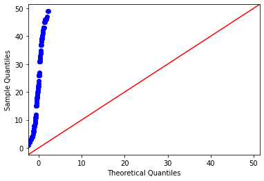
In the above chart, X-axis represents theoretical quantiles, Y-axis represents Sample quantiles.
The data points are the quantile value of each distribution. Basically here idea is to plot the quantile values of two datasets and want to check whether they make a straight line or not.
If the quantiles of the two datasets are similar then they belongs to same distribution otherwise not.
In our example we can see that the sample quantiles i.e. data values are completely different from the theoretical values. The data values are not following the strainght line.This means this data set is not normally distributed.
Create a Q-Q Plot using numpy in Python
In this example, we will generate one dataset using numpy package then we will create Q-Q plot for the dataset using below python code.
# import modules
import numpy as np
import statsmodels.api as sm
import matplotlib.pyplot as plt

# Using seed function to generate the same random number every time with the given seed value
np.random.seed(2)

#create a random dataset with 100 values
data =  np.random.normal(0,1, 1000)

#view first 10 values
print("The data values are as follows :\n",data[:10])

#create Q-Q plot with 45-degree line added to plot
fig = sm.qqplot(data, line='45')
plt.show()
In the above code, first, we import numpy package to use random.randint()function to generate a sample of size 1000.
statsmodels.api package is used to create a qqplot for the data using qqplot() function.
matplotlib.pyplot package is used to plot this created qqplot to visualize the generated data values.
using data[0:10], it prints first 10 rows of data values and generate the qqplot.
Output of above program:
#Output
The data values are as follows :
 [-0.41675785 -0.05626683 -2.1361961   1.64027081 -1.79343559 -0.84174737
  0.50288142 -1.24528809 -1.05795222 -0.90900761]

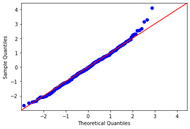
In the above chart, X-axis represents theoretical quantiles, Y-axis represents Sample quantiles.
In this example, we can see that the sample quantiles i.e. data values are almost in the same direction as the theoretical values. The data values are following the straight line. This means this data set is normally distributed.
Conclusion
I hope, you may find how to Create a Q-Q Plot in python tutorial with step by step illustration of examples educational and helpful.