Home » Python » Plot Histogram with several variables in Python

Plot Histogram with several variables in Python

In this article, I will explain you how to plot histogram with several variables on same axis or different axis using python.

Let’s understand plot histogram with variables with examples.

To plot histogram in python use histplot() function of seaborn library.

Installation of Packages

We will need seaborn packages to load dataset and plot histogram If you don’t have these packages installed on your system, install it using below commands.

Plain text
Copy to clipboard
Open code in new window
EnlighterJS 3 Syntax Highlighter
pip install seaborn
pip install seaborn
pip install seaborn

Plot Histogram with several variables on same axis

Let’s see an example to plot histogram with several variables on the same axis in python.

Installation of Packages

We will need seaborn packages to show histogram. Install package using below command.

Plain text
Copy to clipboard
Open code in new window
EnlighterJS 3 Syntax Highlighter
pip install seaborn
pip install seaborn
pip install seaborn

Import libraries

Import seaborn library in our python histogram code.

Plain text
Copy to clipboard
Open code in new window
EnlighterJS 3 Syntax Highlighter
# Import library
import seaborn as sns
# Import library import seaborn as sns
# Import library

import seaborn as sns

Prepare dataset

Seaborn library has inbuilt datasets. We will use tips dataset to visualize histogram

  • Load tips dataset using load_dataset() function of seaborn library
Plain text
Copy to clipboard
Open code in new window
EnlighterJS 3 Syntax Highlighter
# Load the tips dataset
df = sns.load_dataset('tips')
# Load the tips dataset df = sns.load_dataset('tips')
# Load the tips dataset
df = sns.load_dataset('tips')

Cool Tip: Learn How to plot line graph in python !

Plot Histogram using histplot()

Use sns.histplot() function of seaborn module to plot histogram for two variables on the same axis

  • The first argument defines total_bill column data for histogram
  • The second argument defines color as skyblue
  • The third argument defines label as total_bill

To plot second histogram plot on same axis, use data from tip column and assign color as red

Plain text
Copy to clipboard
Open code in new window
EnlighterJS 3 Syntax Highlighter
# Plot Histogram plot with total_bill column
sns.histplot(data=df["total_bill"] , color="skyblue", label="total_bill")
# Plot Histogram plot with tip column
sns.histplot(data=df["tip"] , color="red", label="tip")
# Plot Histogram plot with total_bill column sns.histplot(data=df["total_bill"] , color="skyblue", label="total_bill") # Plot Histogram plot with tip column sns.histplot(data=df["tip"] , color="red", label="tip")
# Plot Histogram plot with total_bill column
sns.histplot(data=df["total_bill"] , color="skyblue", label="total_bill")

# Plot Histogram plot with tip column
sns.histplot(data=df["tip"] , color="red", label="tip")

Histogram Chart Python Code

Use below entire histogram on same axis python code using seaborn library

Plain text
Copy to clipboard
Open code in new window
EnlighterJS 3 Syntax Highlighter
# Import library and dataset
import seaborn as sns
df = sns.load_dataset('tips')
# Plot Histogram plot with total_bill column
sns.histplot(data=df["total_bill"] , color="skyblue", label="total_bill")
# Plot Histogram plot with tip column
sns.histplot(data=df["tip"] , color="red", label="tip")
# Import library and dataset import seaborn as sns df = sns.load_dataset('tips') # Plot Histogram plot with total_bill column sns.histplot(data=df["total_bill"] , color="skyblue", label="total_bill") # Plot Histogram plot with tip column sns.histplot(data=df["tip"] , color="red", label="tip")
# Import library and dataset
import seaborn as sns

df = sns.load_dataset('tips')
 
# Plot Histogram plot with total_bill column
sns.histplot(data=df["total_bill"] , color="skyblue", label="total_bill")

# Plot Histogram plot with tip column
sns.histplot(data=df["tip"] , color="red", label="tip")

Python Histogram on same axis visualization output
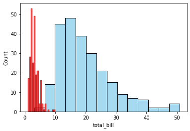
Histogram on same axis for several variables - Python
Histogram on same axis for several variables – Python

Cool Tip: Learn How to plot vertical subplot line graph in python !

Plot Histogram different axis – Horizontal Plot

Let’s see an example to plot histogram with several variables on the different axis horizontal plot.

Installation of Packages

We will need matplotlib and seaborn packages to show histogram. Install package using below command.

Plain text
Copy to clipboard
Open code in new window
EnlighterJS 3 Syntax Highlighter
pip install seaborn
pip install matplotlib
pip install seaborn pip install matplotlib
pip install seaborn
pip install matplotlib

Import libraries

Import seaborn library in our python histogram code.

Plain text
Copy to clipboard
Open code in new window
EnlighterJS 3 Syntax Highlighter
# Import library
import matplot.pyplot as plt
import seaborn as sns
# Import library import matplot.pyplot as plt import seaborn as sns
# Import library
import matplot.pyplot as plt
import seaborn as sns

Prepare dataset

Seaborn library has inbuilt datasets. We will use tips dataset to visualize histogram

  • Load tips dataset using load_dataset() function of seaborn library
Plain text
Copy to clipboard
Open code in new window
EnlighterJS 3 Syntax Highlighter
# Load the tips dataset
df = sns.load_dataset('tips')
# Load the tips dataset df = sns.load_dataset('tips')
# Load the tips dataset
df = sns.load_dataset('tips')

Plot Histogram using displot()

Use sns.displot() function of seaborn module to plot histogram chart for two variables on the different axis horizontal plot.

  • Create subplots for two variables (total_bill and tip column)
  • to plot histogram for total_bill, use df[“total_bill”] and assign color as skyblue, ax=axes[0]
  • to plot histogram for tip, use df[“tip”] and assign color as olive, ax = axes[1]

Plain text
Copy to clipboard
Open code in new window
EnlighterJS 3 Syntax Highlighter
# Create subplots
f, axes = plt.subplots(1, 2, figsize=(7, 5))
# Plot Histogram plot with total_bill column
sns.distplot( df["total_bill"] , color="skyblue", ax=axes[0])
# Plot Histogram plot with tip column
sns.distplot( df["tip"] , color="olive", ax=axes[1])
# Create subplots f, axes = plt.subplots(1, 2, figsize=(7, 5)) # Plot Histogram plot with total_bill column sns.distplot( df["total_bill"] , color="skyblue", ax=axes[0]) # Plot Histogram plot with tip column sns.distplot( df["tip"] , color="olive", ax=axes[1])
# Create subplots 
f, axes = plt.subplots(1, 2, figsize=(7, 5))

# Plot Histogram plot with total_bill column
sns.distplot( df["total_bill"] , color="skyblue", ax=axes[0])

# Plot Histogram plot with tip column
sns.distplot( df["tip"] , color="olive", ax=axes[1])

Histogram Chart Python Code

Use below entire histogram on different axis horizontal plot python code using seaborn library.

Plain text
Copy to clipboard
Open code in new window
EnlighterJS 3 Syntax Highlighter
# Import library
import seaborn as sns
import matplotlib.pyplot as plt
# Load dataset
df = sns.load_dataset('tips')
# Create subplots
f, axes = plt.subplots(1, 2, figsize=(7, 5))
# Plot Histogram plot with total_bill column
sns.distplot( df["total_bill"] , color="skyblue", ax=axes[0])
# Plot Histogram plot with tip column
sns.distplot( df["tip"] , color="olive", ax=axes[1])
# Import library import seaborn as sns import matplotlib.pyplot as plt # Load dataset df = sns.load_dataset('tips') # Create subplots f, axes = plt.subplots(1, 2, figsize=(7, 5)) # Plot Histogram plot with total_bill column sns.distplot( df["total_bill"] , color="skyblue", ax=axes[0]) # Plot Histogram plot with tip column sns.distplot( df["tip"] , color="olive", ax=axes[1])
# Import library
import seaborn as sns
import matplotlib.pyplot as plt

# Load dataset
df = sns.load_dataset('tips')
 
# Create subplots 
f, axes = plt.subplots(1, 2, figsize=(7, 5))

# Plot Histogram plot with total_bill column
sns.distplot( df["total_bill"] , color="skyblue", ax=axes[0])

# Plot Histogram plot with tip column
sns.distplot( df["tip"] , color="olive", ax=axes[1])

Python Histogram on different axis visualization output
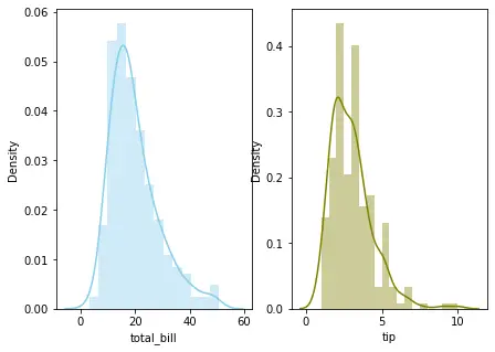
Histogram for several variables on different axis - Python
Histogram for several variables on different axis – Python

Cool Tip: Learn How to plot Treemap chart in python !

Plot Histogram different axis – Vertical Plot

Let’s see an example to plot histogram with several variables on the different axis vertical plot.

Installation of Packages

We will need matplotlib and seaborn packages to show histogram. Install package using below command.

Plain text
Copy to clipboard
Open code in new window
EnlighterJS 3 Syntax Highlighter
pip install seaborn
pip install matplotlib
pip install seaborn pip install matplotlib
pip install seaborn
pip install matplotlib

Import libraries

Import seaborn library in our python histogram code.

Plain text
Copy to clipboard
Open code in new window
EnlighterJS 3 Syntax Highlighter
# Import library
import matplot.pyplot as plt
import seaborn as sns
# Import library import matplot.pyplot as plt import seaborn as sns
# Import library
import matplot.pyplot as plt
import seaborn as sns

Prepare dataset

Seaborn library has inbuilt datasets. We will use tips dataset to visualize histogram

  • Load tips dataset using load_dataset() function of seaborn library
Plain text
Copy to clipboard
Open code in new window
EnlighterJS 3 Syntax Highlighter
# Load the tips dataset
df = sns.load_dataset('tips')
# Load the tips dataset df = sns.load_dataset('tips')
# Load the tips dataset
df = sns.load_dataset('tips')

Plot Histogram using displot()

Use sns.displot() function of seaborn module to plot histogram for two variables on the different axis vertical plot.

  • Create subplots for two variables (total_bill and tip column)
  • to plot histogram for total_bill, use df[“total_bill”] and assign color as skyblue, ax=axes[0]
  • to plot histogram for tip, use df[“tip”] and assign color as olive, ax = axes[1]

Plain text
Copy to clipboard
Open code in new window
EnlighterJS 3 Syntax Highlighter
# Create subplots
f, axes = plt.subplots(2, 1, figsize=(5, 7))
# Plot Histogram plot with total_bill column
sns.distplot( df["total_bill"] , color="skyblue", ax=axes[0])
# Plot Histogram plot with tip column
sns.distplot( df["tip"] , color="olive", ax=axes[1])
# Create subplots f, axes = plt.subplots(2, 1, figsize=(5, 7)) # Plot Histogram plot with total_bill column sns.distplot( df["total_bill"] , color="skyblue", ax=axes[0]) # Plot Histogram plot with tip column sns.distplot( df["tip"] , color="olive", ax=axes[1])
# Create subplots 
f, axes = plt.subplots(2, 1, figsize=(5, 7))

# Plot Histogram plot with total_bill column
sns.distplot( df["total_bill"] , color="skyblue", ax=axes[0])

# Plot Histogram plot with tip column
sns.distplot( df["tip"] , color="olive", ax=axes[1])

Histogram Chart Python Code

Use below entire histogram on different axis horizontal plot python code using seaborn library.

Plain text
Copy to clipboard
Open code in new window
EnlighterJS 3 Syntax Highlighter
# Import library
import seaborn as sns
import matplotlib.pyplot as plt
# Load dataset
df = sns.load_dataset('tips')
# Create subplots
f, axes = plt.subplots(2, 1, figsize=(5, 7))
# Plot Histogram plot with total_bill column
sns.distplot( df["total_bill"] , color="skyblue", ax=axes[0])
# Plot Histogram plot with tip column
sns.distplot( df["tip"] , color="olive", ax=axes[1])
# Import library import seaborn as sns import matplotlib.pyplot as plt # Load dataset df = sns.load_dataset('tips') # Create subplots f, axes = plt.subplots(2, 1, figsize=(5, 7)) # Plot Histogram plot with total_bill column sns.distplot( df["total_bill"] , color="skyblue", ax=axes[0]) # Plot Histogram plot with tip column sns.distplot( df["tip"] , color="olive", ax=axes[1])
# Import library
import seaborn as sns
import matplotlib.pyplot as plt

# Load dataset
df = sns.load_dataset('tips')
 
# Create subplots 
f, axes = plt.subplots(2, 1, figsize=(5, 7))

# Plot Histogram plot with total_bill column
sns.distplot( df["total_bill"] , color="skyblue", ax=axes[0])

# Plot Histogram plot with tip column
sns.distplot( df["tip"] , color="olive", ax=axes[1])

Python Histogram on different axis visualization output
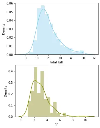
Histogram on different axis vertical plot - Python
Histogram on different axis vertical plot – Python

Cool Tip: Learn How to plot horizontal line graph in python !

Conclusion

I hope you found above article on histogram for several variables on same axis or plot histogram for variables on different axis (horizontal plot) or plot histogram for variables on different axis (vertical plot) using python program informative and educational.