What is Marginal Histogram Plot?
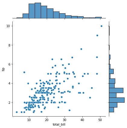
Marginal histogram are the scatter plot having histogram, box plot or dotplot on edges of x-axis and y-axis. To create marginal histogram plot in python use jointplot() function of seaborn library.
In this article, I will explain you how to plot marginal histogram plot in python using seaborn package and customize it for better visualization.
Installation of Packages
We will need pandas and seaborn packages to plot marginal histogram chart in python program. If you don’t have these packages installed on your system, install it using below commands.
pip install pandas
pip install seaborn
Marginal Histogram Plot in Python using seaborn
Let’s see an example to plot marginal histogram chart in python using seaborn and pandas library.
Installation of Packages
We will need seaborn packages to show histogram. Install package using below command.
pip install seaborn
Import libraries
Import seaborn library in our python histogram code.
# Import library

import seaborn as sns
Prepare dataset
Seaborn library has inbuilt datasets. We will use tips dataset to visualize histogram
- Load tips dataset using load_dataset() function of seaborn library
# Load the tips dataset
df = sns.load_dataset('tips')
Cool Tip: Learn How to plot line graph in python !
Marginal Histogram Plot using jointplot()
Use sns.displot() function of seaborn module to draw histogram, displot() function accepts dataframe object as input to plot histogram.
# Plot Marginal histogram plot
# Custom the inside plot: options are: “scatter” | “reg” | “resid” | “kde” | “hex”
sns.jointplot(x=df["total_bill"], y=df["tip"], kind='scatter')
Marginal Histogram Chart Python Code
Use below entire histogram python code using seaborn library
# Import library
import seaborn as sns

# Load the tips dataset
df = sns.load_dataset('tips')

# Plot the Marginal Histogram
# Custom the inside plot: options are: “scatter” | “reg” | “resid” | “kde” | “hex”
sns.jointplot(x=df["total_bill"], y=df["tip"], kind='scatter')
Marginal Histogram Python Visualization Output

Cool Tip: Learn How to plot vertical subplot line graph in python !
Marginal Histogram Plot as Box Plot
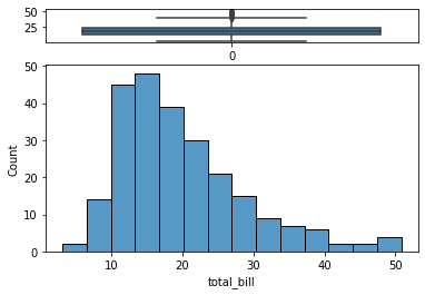
Let’s see an example to plot marginal histogram as box plot in python with bins.
Installation of Packages
We will need matplotlib and seaborn package to plot marginal histogram plot. Install package using below command.
pip install seaborn
pip install matplotlib
Import libraries
Import matplotlib and seaborn library in our python histogram code.
# Import library
import seaborn as sns
import matplotlib.pyplot as plt
Prepare dataset
Seaborn library has inbuilt datasets. We will use tips dataset to visualize histogram
- Load tips dataset using load_dataset() function of seaborn library in variable df
- Use plt.subplots() function to divide plot into 2 charts, histogram and box plot
- Dictionary for Height_Ratio of both plots, assigned it to gridspec_kw parameter
# Load the tips dataset
df = sns.load_dataset('tips')
f, (ax_box, ax_hist) = plt.subplots(2, gridspec_kw={"height_ratios": (.15, .85)})
Add Graph in Each subplot
- Use boxplot() function to plot box chart. First argument in boxplot() function is total_bill column values from tips dataset and set as ax_box
- Use histplot() function to plot histogram chart. First argument in histplot() function is total_bill column values from tips dataset and set as ax_hist
# Add a graph in each part
sns.boxplot(data=df["total_bill"], ax=ax_box)
sns.histplot(data=df["total_bill"], ax=ax_hist)
Marginal Histogram as Box Plot Python Code
Use below entire marginal histogram python code using seaborn library
# Import library and dataset
import seaborn as sns
import matplotlib.pyplot as plt
df = sns.load_dataset('tips')

# Plot 2 subplots
f, (ax_box, ax_hist) = plt.subplots(2, gridspec_kw={"height_ratios": (.15, .85)})

# Add a graph in each part
sns.boxplot(data=df["total_bill"], ax=ax_box)
sns.histplot(data=df["total_bill"], ax=ax_hist)

# Remove x axis name for the boxplot
ax_box.set(xlabel='')
Python Marginal Histogram as Box Plot Visualization Output

Cool Tip: Learn How to plot Treemap chart in python !
Plot Python Histogram Vertical
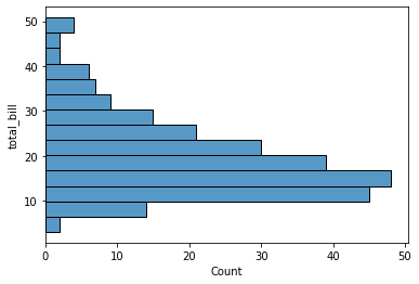
Let’s see an example to plot histogram vertical in python.
Installation of Packages
We will need seaborn package to plot histogram. Install package using below command.
pip install seaborn
Import libraries
Import seaborn library in our python histogram code.
# Import library
import seaborn as sns
Prepare dataset
Seaborn library has inbuilt datasets. We will use tips dataset to visualize histogram
- Load tips dataset using load_dataset() function of seaborn library
# Load the tips dataset
df = sns.load_dataset('tips')
Plot Histogram Vertical using histplot()
Use sns.histplot() function of seaborn module to draw histogram vertical.
histoplot() function accepts dataframe object as input to plot histogram vertical and y = “total_bill”
# Python Vertical histogram
sns.histplot(data=df, y="total_bill")
Python Histogram Vertical Code
Use below entire python histogram vertical code using seaborn library
# Import library and dataset
import seaborn as sns

# Load the tips dataset
df = sns.load_dataset('tips')

# Python Vertical histogram
sns.histplot(data=df, y="total_bill")
Python Histogram Vertical Visualization Output

Cool Tip: Learn How to plot horizontal line graph in python !
Conclusion
I hope you found above article on marginal histogram plot in python program using seaborn package informative and educational.
Use sns.displot() function of seaborn module to create histogram in python program.