What is Area Plot?
Area charts based on line chart having part below line filled with color. An area graph represents change in quantities of one or more groups over time. Area plot are extension of line graph, it display colorful and shows solid part of chart to represent values clear and easily with different shades between the lines.
We can customize the area plot in python by changing appearance of the area chart. We can change color, put the edge, change the edge color and transparency of plot to customize the area plot.
In this article, I will explain you about how to customize the area plot with custom color ,transparency and custom edge ,edge color
Using Parameters for Customizing Area Chart
Parameters using matplotlib.pyplot to customize area plot are given below
Parameters
----------
x : 1d array of dimension N

y : 2d array (dimension MxN), or sequence of 1d arrays (each dimension 1xN)

    The data is assumed to be unstacked. Each of the following
    calls is legal::

        stackplot(x, y)               # where y is MxN
        stackplot(x, y1, y2, y3, y4)  # where y1, y2, y3, y4, are all 1xNm

baseline : {'zero', 'sym', 'wiggle', 'weighted_wiggle'}
    Method used to calculate the baseline:

    - ``'zero'``: Constant zero baseline, i.e. a simple stacked plot.
    - ``'sym'``:  Symmetric around zero and is sometimes called
      'ThemeRiver'.
    - ``'wiggle'``: Minimizes the sum of the squared slopes.
    - ``'weighted_wiggle'``: Does the same but weights to account for
      size of each layer. It is also called 'Streamgraph'-layout. More
      details can be found at http://leebyron.com/streamgraph/.

labels : Length N sequence of strings
    Labels to assign to each data series.

colors : Length N sequence of colors
    A list or tuple of colors. These will be cycled through and used to
    colour the stacked areas.

**kwargs
    All other keyword arguments are passed to `Axes.fill_between()`
Parameters using pandas to customize area plot
Parameters
----------
x : label or position, optional
    Coordinates for the X axis. By default uses the index.
y : label or position, optional
    Column to plot. By default uses all columns.
stacked : bool, default True
    Area plots are stacked by default. Set to False to create a
    unstacked plot.
**kwargs
    Additional keyword arguments are documented in
    :meth:`DataFrame.plot`.
Installation of Packages
We will need numpy and matplotlib packages to plot custom area chart in python. If you don’t have these packages installed on your system, install it using below commands.
pip install numpy
pip install matplotlib
How to Plot Custom Area Chart in Python
Let’s see an example to customize default area chart using custom color and adding transparency to area plot.
Installation of Packages
We will need numpy and matplotlib packages to plot custom area graph. Install packages using below command.
pip install numpy
pip install matplotlib
Import libraries
Import numpy and matplotlib libraries in our python code to get started with plotting area graph.
import numpy as np
import matplotlib.pyplot as plt
Prepare dataset
We will need x and y axis dataset values to plot custom area chart. Lets create dataset for x and y using Numpy arange() to get array object evenly spaces values within given range
# Create dataset
x=np.arange(1,15)
y=[23,15,67,34,56,87,56,29,59,80,45,84,26,64]
Plot Custom Area chart using fill_between()
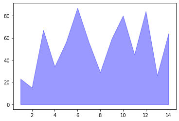
using matplotlib fill_between() function which accepts x and y values to plot area chart. Here we have used color of area plot as blue and alpha = 0.4 for transparency.
plt.fill_between( x, y, color="blue", alpha=0.4)
Show Area Chart
Using Matplotlib show() function to show the graphical view of area chart.
plt.show()
Custom Area plot Python Code
Use below custom area plot in python using Matplotlib source code
# Import libraries

import numpy as np
import matplotlib.pyplot as plt

# Create data
x=np.arange(1,15)
y=[23,15,67,34,56,87,56,29,59,80,45,84,26,64]

# Change the color and its transparency
plt.fill_between( x, y, color="blue", alpha=0.4)
plt.show()
Custom Area Plot Visualization Output

Custom Area plot in Python using Matplotlib
Let’s see an example to customize area chart using custom color and adding transparency ,edge and edge color to area plot.
Installation of Packages
We will require numpy and matplotlib packages installed on our system to plot custom area plot. If we don’t have packages installed, we can install packages with the command below.
pip install numpy
pip install matplotlib
Import libraries
We will import numpy and matplotlib libraries to plot area plot. We have imported the numpy library as np and matplotlib.pyplot library as plt to reduce the complexity of code.
import numpy as np
import matplotlib.pyplot as plt
Prepare dataset
We have created variables x and y as datasets to plot area plot using matplotlib stackplot() function. Let’s create dataset for x and y using Numpy arange() to get array object evenly spaces values within given range
# Create dataset
x=np.arange(1,15)
y=[23,15,67,34,56,87,56,29,59,80,45,84,26,64]
Fill Custom Area chart using fill_between()
we have used fill_between function of matplotlib.pyplot to plot area plot.
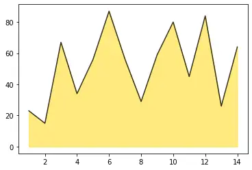
The values of x and y dataset are assigned in fill_between() we have assigned color of plot as gold and alpha as 0.5 for transparency.
plt.fill_between( x, y, color="gold", alpha=0.5)
Plot Custom Area Chart
We have assigned color of edge as black and alpha as 0.8 for transparency.
plt.plot(x, y, color="black", alpha=0.8)
Custom Area Python Source Code
Use below entire source code to plot custom area plot in python using Matplotlib.
# Import libraries

import numpy as np
import matplotlib.pyplot as plt

# Create data
x=np.arange(1,15)
y=[23,15,67,34,56,87,56,29,59,80,45,84,26,64]

# Same, but add a stronger line on top (edge)
plt.fill_between( x, y, color="gold", alpha=0.5)
plt.plot(x, y, color="black", alpha=0.8)
Custom Area Chart Visualization output

Cool Tip: Learn how to plot basic stacked area chart in python !
Improved Area Plot in Python
Lets consider and example to improve the custom area chart by adding white grid to plot and by setting title and xlabel, ylabel to area plot.
Installation of Packages
We will need numpy, matplotlib and seaborn packages to plot custom area graph. Install packages using below command.
pip install numpy
pip install seaborn
pip install matplotlib
Import libraries
We will import numpy, matplotlib and seaborn libraries to plot area plot. We have imported the numpy library as np and matplotlib.pyplot library as plt to reduce the complexity of code.
# libraries
import numpy as np
import seaborn as sns
import matplotlib.pyplot as plt
Prepare dataset
We have create dataset for x using numpy arange() to get array of object which contain 29 values. We have created another dataset for Y having random 29 numbers between 8,20
x = np.arange(30)
y = np.random.randint(8, 20, 30)
Create Color Palette
Lets set the color palette as set2 and style as whitegrid to plot white grid background.
blue, = sns.color_palette("Set2", 1)
sns.set_style("whitegrid")
Plot Edge
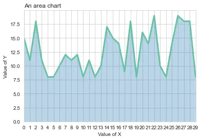
Using matplotlib.pyplot plot() function to plot edge i.e., line plot. the values of x and y dataset are assigned in plot(). We have assigned color of edge as blue and line width as 3.
ax.plot(x, y, color=blue, lw=3)
Plot Area chart
Using matplotlib.pyplot fill_between() to plot area plot. The values of x and y dataset assigned in fill_between() and color of plot as default and alpha as 0.3 for transparency.
We have set the x limit and y limit and set xticks as x.
ax.fill_between(x, 0, y, alpha=.3)
ax.set(xlim=(0, len(x) - 1), ylim=(0, None), xticks=x)
Show Area Chart
In the below code, we are using matplotlib plot to set title,xlabel and ylable. We have assigned title location to left.
Using Matplotlib show() function to show the graphical view of area chart.
plt.title("An area chart", loc="left")
plt.xlabel("Value of X")
plt.ylabel("Value of Y")
plt.show()
Area plot Python Code
# libraries
import numpy as np
import seaborn as sns
import matplotlib.pyplot as plt

# Create data
x = np.arange(30)
y = np.random.randint(8, 20, 30)

# Color palette
blue, = sns.color_palette("Set2", 1)
sns.set_style("whitegrid")

# Make the plot
fig, ax = plt.subplots()
ax.plot(x, y, color=blue, lw=3)
ax.fill_between(x, 0, y, alpha=.3)
ax.set(xlim=(0, len(x) - 1), ylim=(0, None), xticks=x)

# Add titles and show
plt.title("An area chart", loc="left")
plt.xlabel("Value of X")
plt.ylabel("Value of Y")
plt.show()
Show Area Chart

Conclusion
I hope you found above article on custom area plot in python using matplotlib package informative and educational.