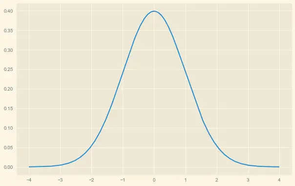
The normal distribution is informally called a bell curve because it has bell shape structure.

In this article, we will discuss how to make a bell curve in python, and also we will calculate the area under the normal curve.
pip install numpy
If you don’t have numpy package installed on your system, installed it using the below commands on the window system.
pip install numpy
pip install scipy
If you don’t have scipy package installed on your system, installed it using the below commands on the window system.
pip install scipy
Example 1: How to Make a Bell Curve in Python
Lets discuss with example to draw bell curve in python.
Lets generate a normal distribution with mean = 0 and standard deviation = 1.
# import modules
import numpy as np
import matplotlib.pyplot as plt
from scipy.stats import norm

#define mean and standard deviation
mean1 = 0
sd1 = 1

#define lower and upper bounds for x-axis
lower_bound = -4
upper_bound = 4

#create range of x-values from lower to upper bound in increments of .001
x = np.arange(lower_bound,upper_bound, 0.001)

#create range of y-values that correspond to normal pdf with mean1=0 and sd=1
y = norm.pdf(x,0,1)

# build the plot
fig, ax = plt.subplots(figsize=(9,6))
ax.plot(x,y)

#define title for the plot
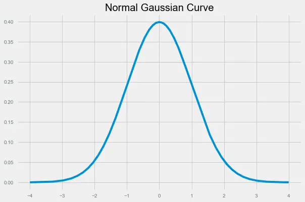
ax.set_title('Normal Gaussian Curve')


#choose plot style and display the bell curve
plt.style.use('fivethirtyeight')
plt.show()
In the above code, we import scipy package and use norm() function to generate normal distribution.
matplotlib.pyplot package is used to build the plot for randomly generated normal distribution data values.
To visualize distribution data values, we use plot() function to display the bell curve of the sample data values.
By using pyplot.style.use() function we are providing the “fivethirtyeight” theme for the plot.
Note that you can also style the graph in any way by using the matplotlib styling options.
For example, “solarlight”,”fivethirtyeight”,”bmh”, “dark_background”,”ggplot”,”classic”,”seaborn-white”,”seaborn-whitegrid” etc and many more themes are available.
You can easily use any theme according to your requirements.
Output of above program:

Example 2: How to fill the area in Bell Curve in Python
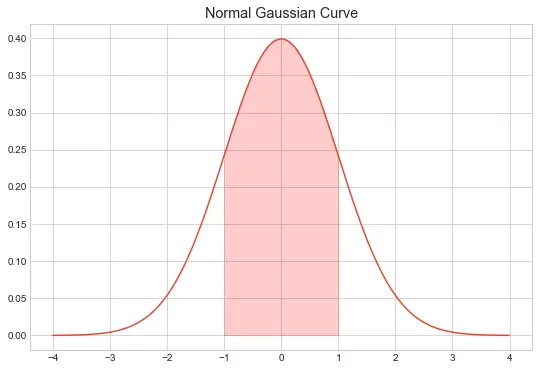
In this example, we will draw the bell curve with “seaborn-whitegrid” and fill the area in the bell curve of the specific region.
import numpy as np
import matplotlib.pyplot as plt
from scipy.stats import norm

#define mean and standard deviation
mean1 = 0
sd1 = 1

#define lower and upper bounds for x-axis
lower_bound = -4
upper_bound = 4

#create range of x-values from lower to upper bound in increments of .001
x = np.arange(lower_bound,upper_bound, 0.001)

#create range of y-values that correspond to normal pdf with mean1=0 and sd=1
y = norm.pdf(x,0,1)

# build the plot
fig, ax = plt.subplots(figsize=(9,6))
ax.plot(x,y)

#specify the region of the bell curve to fill in
x_fill = np.arange(-1, 1, 0.001)
y_fill = norm.pdf(x_fill,0,1)
ax.fill_between(x_fill,y_fill,0, alpha=0.2, color='red')

#define title for the plot
ax.set_title('Normal Gaussian Curve')


#choose plot style and display the bell curve
plt.style.use('seaborn-whitegrid')
plt.show()
In the above code, we import scipy package and used norm() function to generate normal distribution as we did in the last example.
matplotlib.pyplot package is used to build the plot for randomly generated normal distribution data values.
Here, we are filling the area under the bell curve ranging from -1 to -1 using the fill_between() function with red color.
By using pyplot.style.use() the function we are providing the “seaborn-whitegrid” theme for the plot.
To visualize distribution data values, we have used plot() the function which plot chart as below

Note:- You can give any color to the shaded area in this example we used red color.
Conclusion
I hope you may have liked the above article about how to make bell curve in python with step by step guide and with illustrative examples