Ogive graphs are used to estimate how many numbers lie below or above a particular variable or value in data. To construct an Ogive, the cumulative frequency of the variables is calculated using a frequency table.
Ogive graphs are also known as cumulative frequency graph.
In this tutorial, we will discuss about how to create an Ogive Graph in python and ogive graph examples.
pip install numpy
If you don’t have numpy package installed on your system, installed it using the below commands on the window system
pip install numpy
Example 1: How to Create an Ogive in Python
Let’s discuss with example to create an ogive graph in python
Step 1 – Create Dataset
Let’s generate an random array of 1000 values between 0 and 10.
#import modules
import numpy as np
import matplotlib.pyplot as plt

# Using seed function to generate the same random number every time with the given seed value
np.random.seed(0)

#create array of 1,000 random integers between 0 and 10
data = np.random.randint(0, 10, 1000)

#Print the first ten elements of array
print('The firts ten elements are as follows:',data[:10])

#Find histogram values with 10 bins
values, base = np.histogram(data, bins=10)

#find the cumulative sums
cumulative = np.cumsum(values)

# plot the ogive
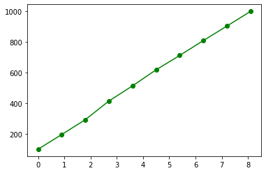
plt.plot(base[:-1], cumulative, 'go-')
In the above code, we import numpy package to use random.randint() function to generate a random array.
Step2 – Create an Ogive graph
histogram() function is used to calculate the classes, class frequencies and cumsum() function is used to calculate the cumulative sums for the calculated class frequencies.
matplotlib.pyplot package is used to plot the ogive to visualize data for generated data values.
using data[0:10], it prints first 10 rows of data values.
To visualize distribution data values, we use plot() function to display ogive of the samples data values.
The arguments used in plot function ‘go-‘ defines:
g : Use the green(g) color for the plot
o : Use the circles at each class break.
– : Use lines to connect the circles.
You can easily change these options according to the requirements.
Output of above program:
The firts ten elements are as follows: [5 0 3 3 7 9 3 5 2 4]

Example 2: How to Create an Ogive Graph in Python
In this example, we will create an ogive graph for random generated array using below python code.
Step1 – Create Dataset
In the above python code, generate a random array using the numpy library.
Step2 – Create an Ogive Graph
#import modules
import numpy as np
import matplotlib.pyplot as plt

# Using seed function to generate the same random number every time with the given seed value
np.random.seed(0)

#create array of 100 random integers between 90 and 100
data = np.random.randint(90, 100, 100)

#Print the first ten elements of array
print('The firts ten elements are as follows:',data[:10])

#Find histogram values with 30 bins
values, base = np.histogram(data, bins=30)

#find the cumulative sums
cumulative = np.cumsum(values)

# plot the ogive
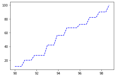
plt.plot(base[:-1], cumulative, 'b--')
The output of the above python code is below, we have used print(data[0:10]) to print the first 10 rows of distribution data.
The firts ten elements are as follows: [95 90 93 93 97 99 93 95 92 94]
Step3 – Visualize Graph
To visualize distribution data values, we use plot() function to display ogive of the samples data values. Here we find the classes and class frequencies with respect to 30 bins.

In the above graph we use the “b–” arguments in the plot() function which defines:
b : Use the blue(b) color for the plot
– : Use the lines at each class break.
– : Use lines to connect the class break lines.
Conclusion
I hope you may have liked the above article about how to create an ogive graph in python with step by step guide and with illustrative ogive graph examples.